How to Increase Your Website's Conversion Rate with a "Process Section"
Have you ever invested in a beautifully designed website, only to look at the results it brought back and feel like crying?
While a competitor's ordinary-looking website somehow blows past its sales targets.
Honestly, this is completely normal, because the thing many people overlook, yet which is a key factor in significantly raising conversion rate, is the "Process Section," the part that shows how the work is done.
So what exactly is a Process Section?
A Process Section is the area on a website used to show a business's workflow or service process, making it easy for customers to understand what happens after they click that button.
Think about it: when we're about to buy something online, what do we think about before clicking "Order"?
- "After I click this button, what happens next?"
- "How complicated is the work process?"
- "What will the final result be?"
This is exactly it: a good Process Section answers all of these questions.
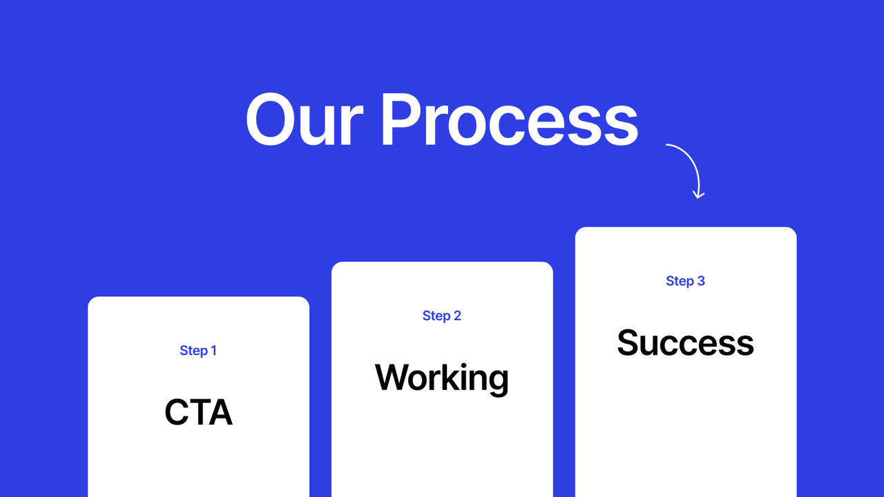
My secret 3-step Process Section formula that works
Step 1: Make the CTA and the first step one and the same
This is where many people slip up. We tend to make the CTA one thing and the steps another, as if they're unrelated.
Look at this example:
A web design company doing it wrong:
- CTA: "Get a free consultation"
- Step 1: "Design the website"
A web design company doing it right:
- CTA: "Get a free consultation"
- Step 1: "Receive a consultation and needs analysis"
See the difference? The second one makes it clearer what you'll get after clicking the button.
Try using it. The result will:
- Keep customers from being confused about what they'll get after clicking
- Reduce hesitation in deciding
- Boost customer confidence
Step 2: Show off your workflow
This second step is the heart of the Process Section. You have to explain how you work, but in language that's easy to understand.
For example, an app development company might write:
"Design and develop the application"
- Analyze and plan the structure
- Design the UI/UX to fit the requirements
- Develop and write the application code
- Test the functionality and fix bugs
- Improve and optimize performance
Or a digital marketing company:
"Plan and run end-to-end marketing"
- Analyze the target audience and competitors
- Build a tailored marketing strategy
- Produce and publish quality content
- Track and analyze the results
- Continuously improve the strategy
When customers read this, they'll feel, "Oh, they really do work systematically."
Step 3: Sell the customer a dream (but a dream that can come true)
This final step is very important. You have to let customers picture what they'll get after using your service.
Here are some appealing examples:
A weight-loss company: "Transform into a confident new you"
- Lose weight to your set goal
- Be healthier with more energy
- Feel confident and proud of yourself
- Change your eating and exercise habits for life
An SEO company: "Rank #1 on Google and blow past your sales targets"
- Your website reaches Google's first page for key keywords
- Significantly increase your website visitors
- Multiply your online sales
- Generate ongoing income online
Why does a Process Section help increase conversion?
1. We humans don't like uncertainty
Think about it: when we don't know what will happen after clicking a button, we tend to hesitate, right?
A Process Section reduces this uncertainty by showing customers a clear path.
2. It builds trust
Showing a systematic workflow makes customers feel you're professional and trustworthy.
3. It manages expectations
When customers know what they'll get, when, and in what form, they won't be disappointed and will be more satisfied.
Design techniques I've used that work
1. Use visual elements appropriately
- Icons: pick ones that are easy to understand; don't use strange ones
- Arrows or connecting lines: clearly show the flow of the steps
- Color: use colors consistent with your brand
- Font: easy to read; don't get too fancy
2. Write content ordinary people can understand
- Avoid complex technical jargon
- Each step shouldn't be too long
- Emphasize the benefits the customer will get
- Use words that create positive emotion
3. Choose a layout that fits the content
- Horizontal: good for sequential steps
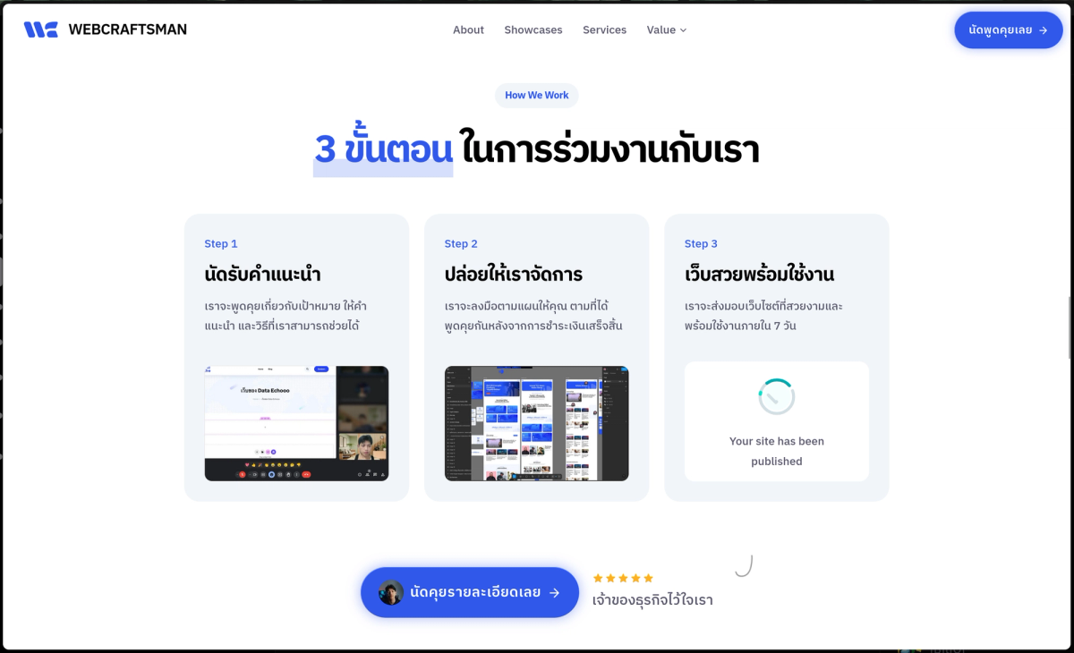
Horizontal Flow from webcraftsman.co
- Vertical: good for mobile and content with a lot of detail
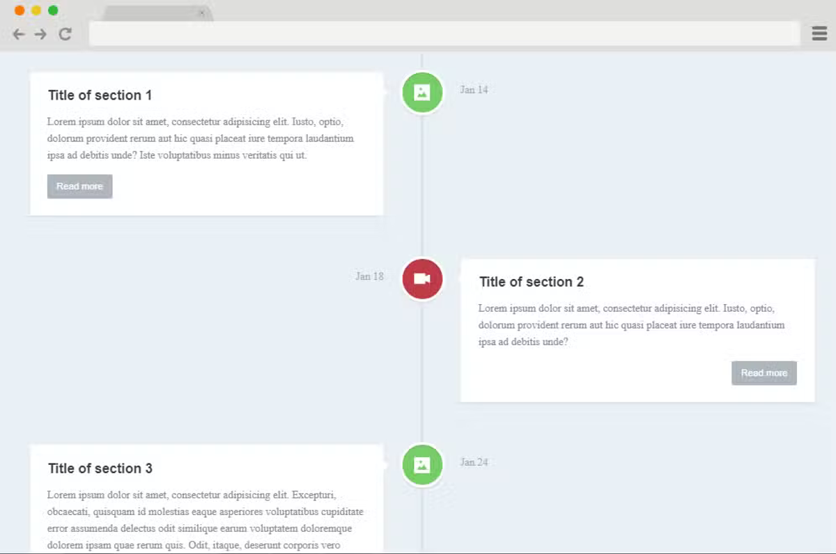
Vertical Timeline from https://uicookies.com/vertical-timeline/
- Circular: creates a feeling of a continuous process
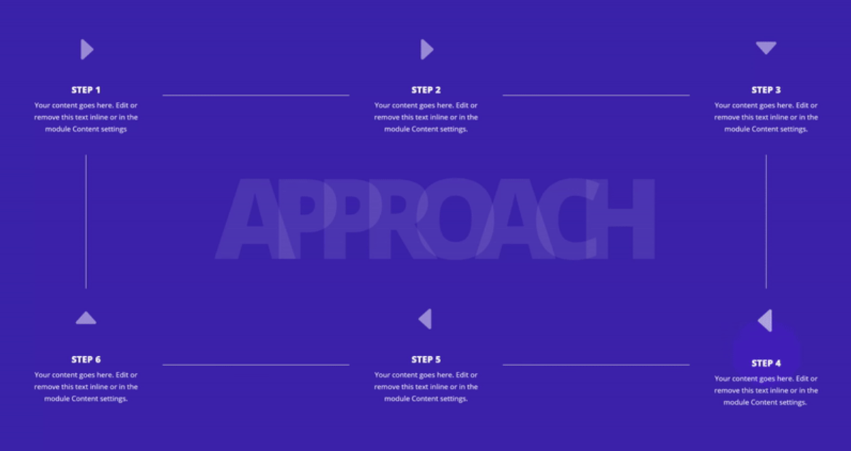
Circular Process from https://www.elegantthemes.com/blog/divi-resources/creating-an-our-process-section-with-divis-new-column-structures
Common mistakes (and how to fix them)
1. Making it too complicated
Many people try to explain every detail until customers feel confused.
Fix: remember that "simple but complete" is what matters.
2. The CTA and the first step don't match
If they don't align, it confuses customers.
Fix: make the first step reflect the same action as the CTA.
3. Emphasizing features over benefits
Customers care more about what benefit they'll get than about knowing what you can do.
Fix: write from the customer's point of view.
Conclusion: the Process Section is the secret many people overlook
A good Process Section isn't just website decoration; it's an extremely powerful marketing tool.
When you build a 3-step Process Section the way I recommend:
Step 1: make it align with the CTA
Step 2: show a professional workflow
Step 3: present the result the customer dreams of
You'll see a clear change:
- Conversion rate rises significantly
- Bounce rate drops
- Customer trust increases
- You stand out from competitors
A good Process Section tells the story of a transformation, from problem to solution, and from solution to success.
Try applying it to your own website, then come tell me how it goes!