Why Running Ads Might Not Boost Your Sales (And How to Fix It)
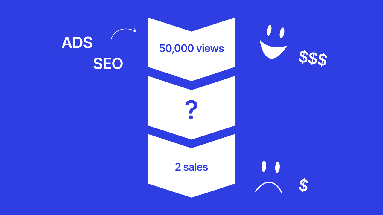
Imagine you've just run a new Facebook Ads campaign, spent 50,000 baht, and got 10,000 visitors, but when you check the sales, only 2-3 came in.
Or maybe you've done SEO for months and finally ranked #1 on Google, with lots of traffic coming in, but fewer customers contact you than there should be.
Many people spend tens or hundreds of thousands on marketing and only get lots of traffic but no sales, which works out to a conversion rate of just 0.5-1%.
Honestly, this is normal, because most of us focus on getting traffic, like buying ads and doing SEO, but forget the most important thing: a landing page that can turn traffic into customers.
So what exactly is a landing page?
A landing page is the web page customers see when they click through from an ad or a Google search. It's like the first salesperson who greets a customer walking into the shop.
Think about it: if you walked into a shop and the staff ignored you, didn't know what you wanted, or spoke unclearly, would you buy anything? Of course not.
A landing page is the same: if it's poorly designed, customers click away immediately.
Why do people tend to overlook the landing page?
Now that you understand what a landing page is, ask yourself:
- "I run ads and get lots of traffic, so why do I sell so little?"
- "My SEO ranks #1, so why don't customers contact me?"
- "Lots of people visit the site, but no one orders."
Because we forget that getting traffic is only half of selling. The other half is converting that traffic into sales!
It's like opening a shop: you advertise to get people to visit (traffic), but once they're inside, if the shop isn't inviting to walk through, they don't know what you sell, how much it costs, or how to buy, the customer walks right back out.

Source: https://www.mprnews.org/story/2014/08/24/california-earthquake
My secret 4-step landing page design formula that works
Let's look at the formula I use to raise conversion rate from 1% to 8-12%:
1. Create a headline that lands in under 3 seconds
People decide within the first 3 seconds whether to stay or not.
Don't write "Our company was founded 20 years ago with extensive experience…"
Change it to "Lose 10 kg in 90 days without giving up food."
Look at Bulletpen AI's landing page. They say nothing about themselves in the headline; they write "Write great essays while you sleep" and from just that line you know exactly what the software does.
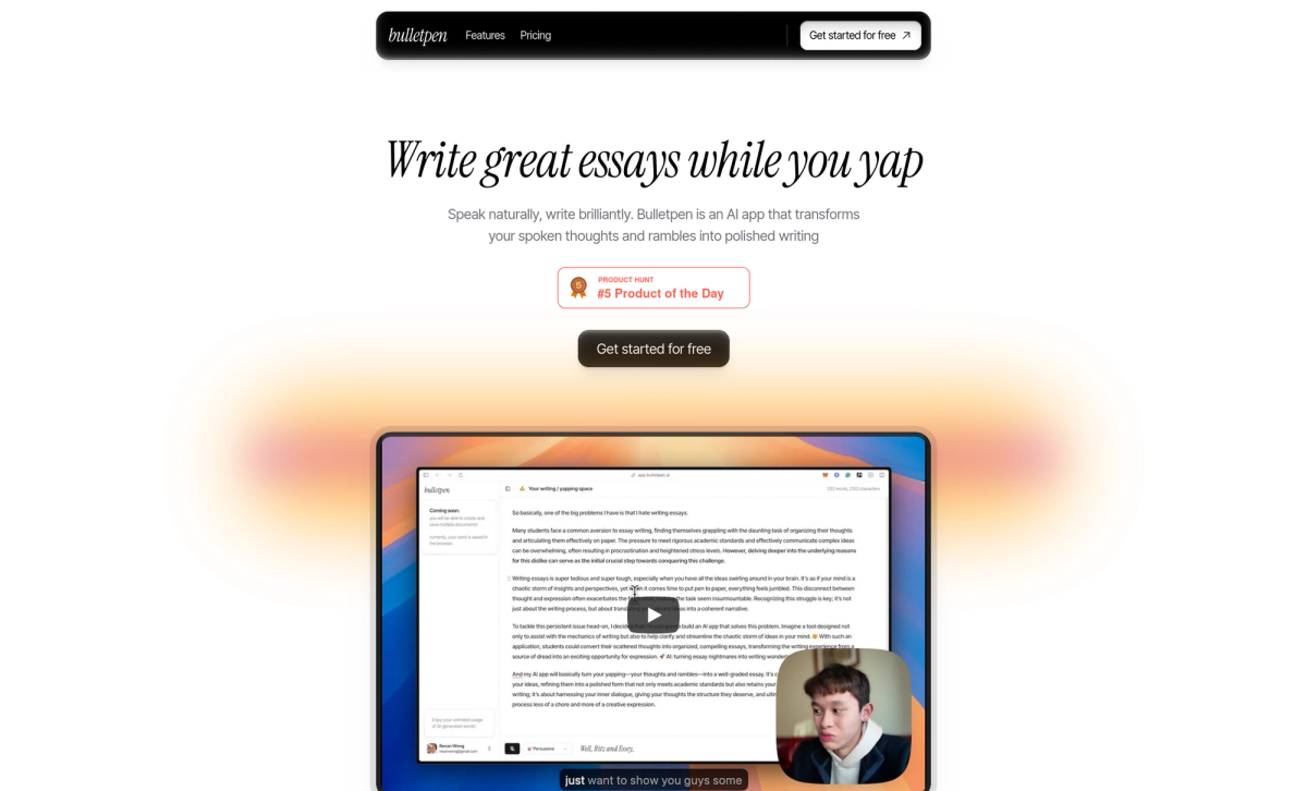
Screenshot of bulletpen.ai
2. Add social proof so people trust you
People decide to buy more easily when they see that others have bought and were satisfied.
As I mentioned in How to Build Website Credibility with Testimonials, where I recommend adding detailed real customer reviews, there are also other things you can add, such as the number of customers using your product and any awards you've won, for example:
- Add video reviews from 10 students
- Show the number of students who've taken it: "more than 2,500 people"
- Add images of certificates or awards you've received
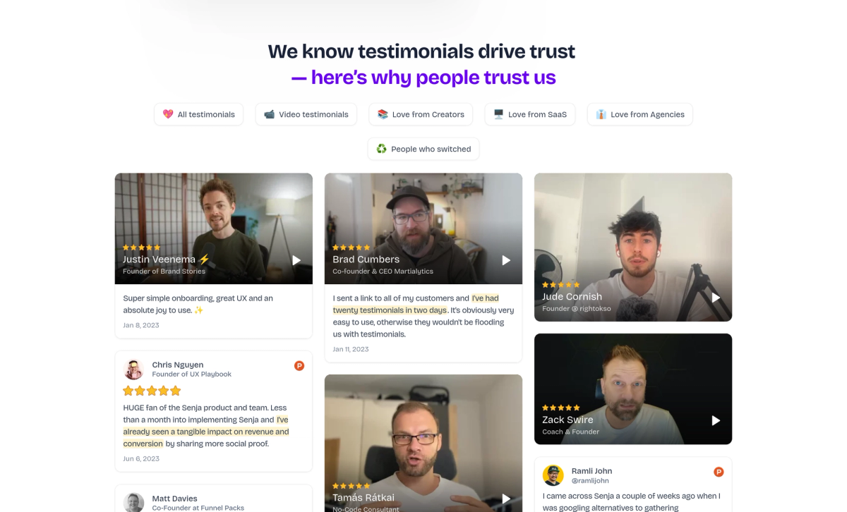
Screenshot of senja.io
3. Design a clear call-to-action
So customers know what to do next.
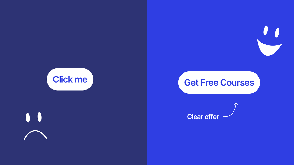
Writing just "Submit" or "Click Here" on the button says nothing about your offer.
Try writing something more specific, such as "Get the free course" or "Start your trial today."
4. Reduce worry with risk reversal
People tend to fear risk; even over small things, they need to feel confident before deciding.
I'd recommend offering a guarantee, a free trial, or a 100% money-back guarantee to make people more confident.
The thing businesses tend to worry about is not wanting to take the risk on themselves, so they don't dare offer a money-back guarantee.
But in reality, if your product or service has no serious problems, very few customers actually claim a refund. If they're not satisfied, at most they leave a 1-star review and don't come back.
If you're genuinely confident in your offer, a guarantee brings nothing but upside.
Design techniques that actually work
Here are some extra techniques I use often:
- Use a standout color for the CTA button: use a color that contrasts with the site's main color, for example if the site is green, use an orange CTA; if the site is purple, use a yellow CTA. It catches the eye better than using the main color or a similar shade.
- Use real photos: too many stock photos make you look less credible; use photos of your real team or customers instead.
- Write short, concise copy: for any text that runs long, use bullet points or insert images frequently as visual breaks.
- Make it load fast: WP Rocket says the statistic is that most people will wait no more than 3 seconds for a page to load; longer than that and they click away.
- Mobile-friendly: 80% of people visit on mobile, so it has to look good on a small screen.
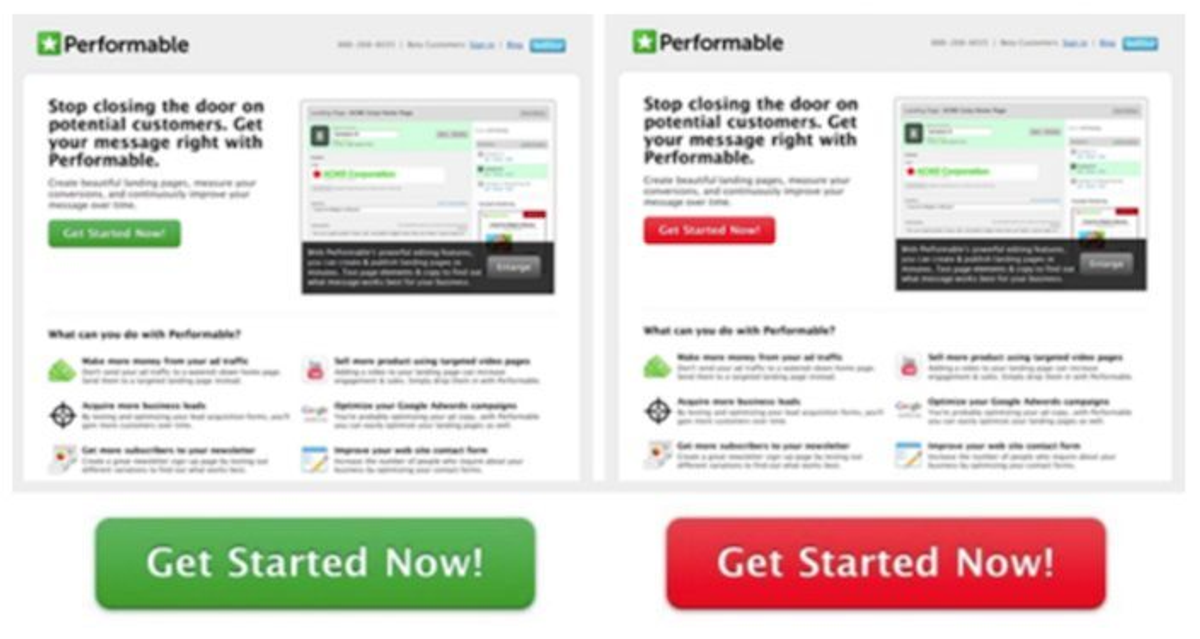
The red button outperformed green by 21% | Source: https://instapage.com/blog/landing-page-colors-influence-on-landing-pages/
Common mistakes (and how to fix them)
1. Including too much information
Many people think the more information they add, the better customers will understand, but in reality too much information confuses people. Keep only the 3-4 key points that directly answer what the customer needs.
2. No clear value proposition
The site says "we provide great service" but doesn't say how it's great or how it differs from competitors.
Fix it by writing a headline that clearly states the benefit, such as "Save 5 hours a week with automated accounting."
3. An unclear CTA
Too many buttons so people don't know which to click, or buttons too small to see.
Use only 1-2 primary CTA buttons, large, in a standout color, placed in important spots.
4. Not testing and improving
Building a landing page and leaving it alone, never collecting data on how it performs.
I recommend using Google Analytics to watch your conversion rate, then test and improve once a month.
The landing page is the key to selling online
Don't forget that complete marketing = getting traffic + converting traffic.
If you only do SEO or ads without caring about the landing page, it's like carrying water in a basket: the money you spend on advertising goes to waste.

The 4-step formula I shared:
Create a headline that lands - grab attention in the first second
Add social proof - build trust
Design a clear CTA - tell people what to do
Reduce worry with risk reversal - give people the confidence to decide
Small changes to your landing page can genuinely transform your business.
Try applying it to your landing page, then come tell me how it goes!